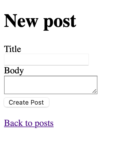
Some of the developers don’t like to work with frontend. To be honest - me too. Especially for us, Lucas Larroche have developed an awesome library named pico.css (github: https://github.com/picocss/pico). All you need is to add it to your application, and you can just focus on backend and use basic HTML tags and helpers. Fantastic!
Well, let’s try it with a new rails application.
rails new demo_app && cd demo_appThen we will create a scaffold for posts …
rails g scaffold Post title body:text… and point it as a root route
Rails.application.routes.draw do
  resources :posts
  root "posts#index"
end
Now, let’s try to add pico.css to your application. I’ve generated app with importmaps, so i cannot add pico.css as a npm package, but if you use cssbundling-rails gem - you’ll have no limitation. There are 3 ways to use pico.css with your app:
- download it from GitHub repository and add it to your application.css file
- install from CDN
- install with NPM
I’ve added it using link to CDN via adding to app/views/layouts/application.html.erb
<!DOCTYPE html>
<html>
  <head>
    <title>DemoApp</title>
    <meta name="viewport" content="width=device-width,initial-scale=1">
    <%= csrf_meta_tags %>
    <%= csp_meta_tag %>

    <%= stylesheet_link_tag "application", "data-turbo-track": "reload" %>
    <%= javascript_importmap_tags %>

    <!-- I've added line below -->
    <link
      rel="stylesheet"
      href="https://cdn.jsdelivr.net/npm/@picocss/pico@2/css/pico.min.css"
    >
  </head>

  <body>
    <!-- I've wrapped content/yield block in .container -->
    <div class="container">
      <%= yield %>
    </div>
  </body>
</html>
Also, (but it is not necessary) I’ve added dark theme. For that I’ve added the following styles to app/assets/stylesheets/application.css file as described here:
/* Amber Light scheme (Default) */
/* Can be forced with data-theme="light" */
[data-theme='light'],
:root:not([data-theme='dark']) {
  --primary: #ffb300;
  --primary-hover: #ffa000;
  --primary-focus: rgba(255, 179, 0, 0.125);
  --primary-inverse: rgba(0, 0, 0, 0.75);
}

/* Amber Dark scheme (Auto) */
/* Automatically enabled if user has Dark mode enabled */
@media only screen and (prefers-color-scheme: dark) {
  :root:not([data-theme]) {
    --primary: #ffb300;
    --primary-hover: #ffc107;
    --primary-focus: rgba(255, 179, 0, 0.25);
    --primary-inverse: rgba(0, 0, 0, 0.75);
  }
}

/* Amber Dark scheme (Forced) */
/* Enabled if forced with data-theme="dark" */
[data-theme='dark'] {
  --primary: #ffb300;
  --primary-hover: #ffc107;
  --primary-focus: rgba(255, 179, 0, 0.25);
  --primary-inverse: rgba(0, 0, 0, 0.75);
}

/* Amber (Common styles) */
:root {
  --form-element-active-border-color: var(--primary);
  --form-element-focus-color: var(--primary-focus);
  --switch-color: var(--primary-inverse);
  --switch-checked-background-color: var(--primary);
}
Let’s check how it looks like

Well, not bad, comparing to default style

There are some more similar frameworks, but I’ve chosen another one, which doesn’t require special classes to create pretty output. It is milligram. To install it to our rails application, I’ve replaced pico’s stylesheet with the following
<!-- Google Fonts -->
<link
  rel="stylesheet"
  href="https://fonts.googleapis.com/css?family=Roboto:300,300italic,700,700italic"
/>

<!-- CSS Reset -->
<link
  rel="stylesheet"
  href="https://cdnjs.cloudflare.com/ajax/libs/normalize/8.0.1/normalize.css"
/>

<!-- Milligram CSS -->
<link
  rel="stylesheet"
  href="https://cdnjs.cloudflare.com/ajax/libs/milligram/1.4.1/milligram.css"
/>

<!-- You should properly set the path from the main file. -->
as described here Yay! Looks good!

Now i have another problem - I cannot choose what I like more, but it is a topic for another post :)